Getting to the point
Getting to the point was the main inspiration behind the new Vision Logistics logo. Logistics is all about getting from point A to point B and although logistics can sometimes be more complicated we wanted to express how easy Vision could make the process. It was for this reason that the word ‘logistics’ was removed from the logo and why the word vision always ends with a point.

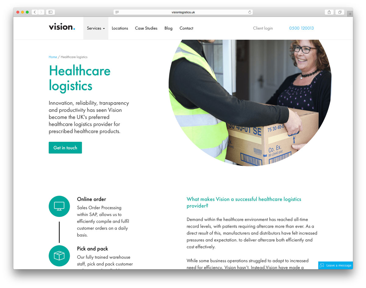
It was quickly identified that the core services that the company offered could be separated into four key areas—this was expressed in separate colours to make them easily identifiable. The user journey through the website should be easy and reassuring and, most importantly, without distraction.
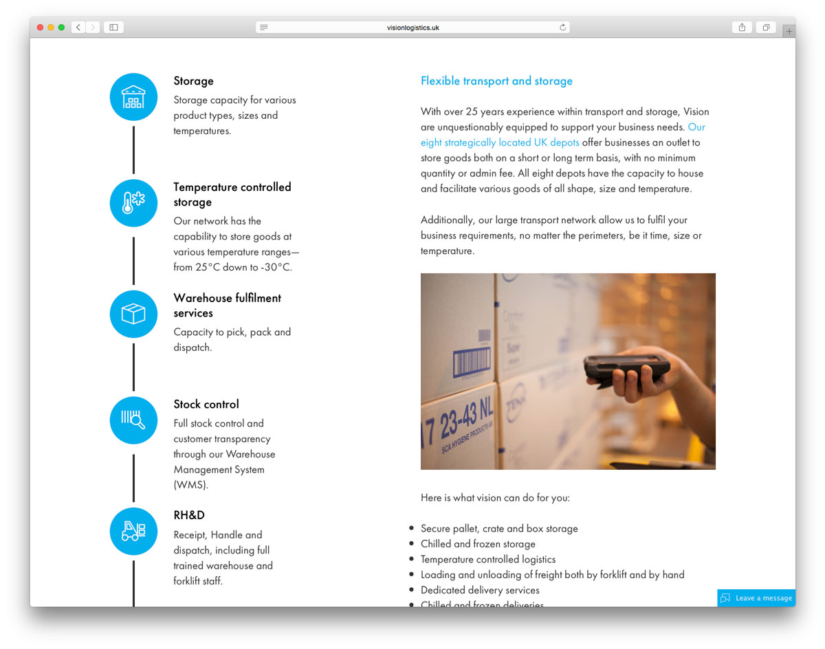
The ‘getting to the point’ theme was used throughout the website and circular elements were used to add an interesting look to the website rarely used online.


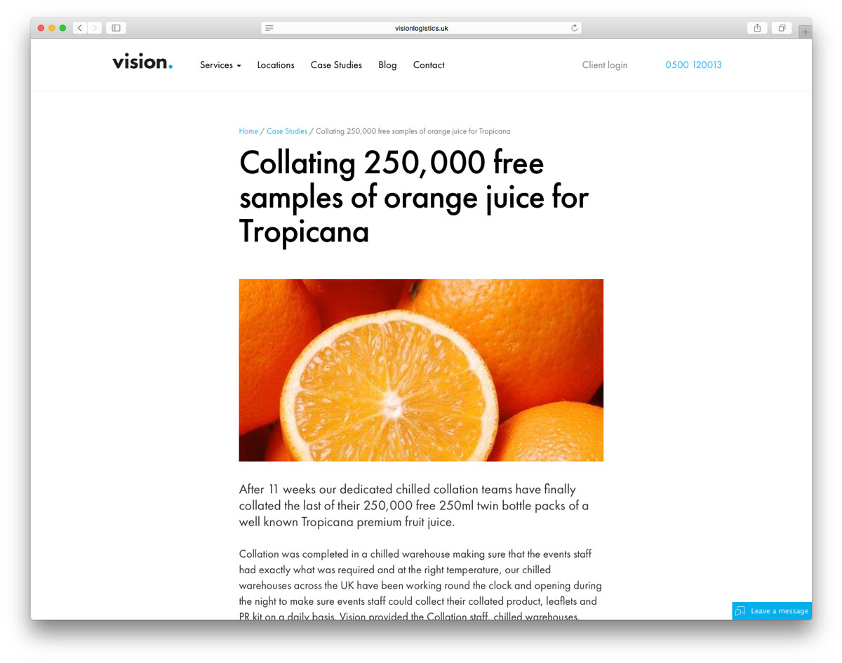
Case studies and blog articles are presented in a distraction-free style and this allows for a clearer reading experience for the user.