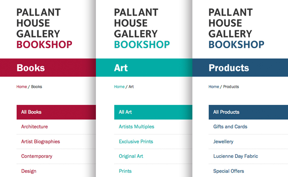
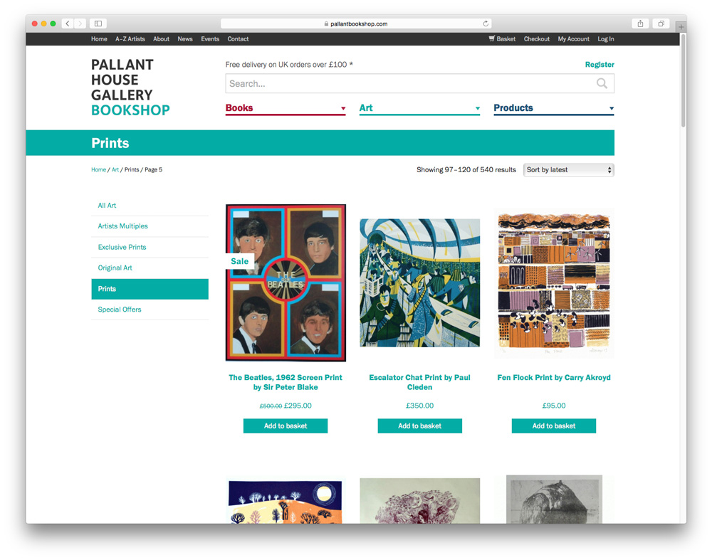
The brief stated that a greater distinction was needed between their three main categories of products: Books, Art and Other Products. In my design for the site I introduced a new colour palette for the store to distinguish between these sections; the existing red would be used for books, a teal colour for the art and a blue for the other products. This is reflected throughout the branding and is included on the website in menus, links and even the logo—the user really does know which part of the site they are in.
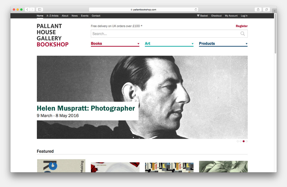

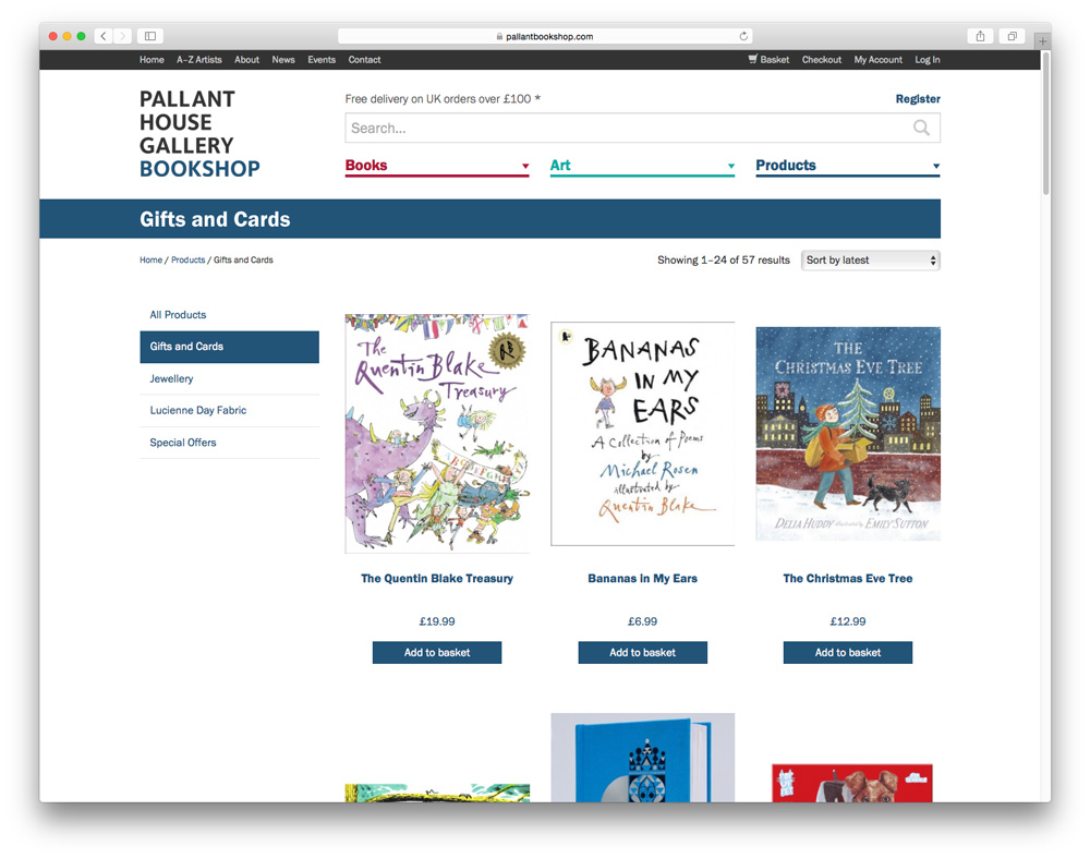
Despite the fact that we wanted to build a modern-looking website we wanted to maintain an element of tradition & character and to do this we chose Franklin Gothic as the typeface to use throughout (we used the URW version due to better on-screen performance). Morris Fuller Benton’s Franklin Gothic was developed in the 20th Century and has been used in many newspapers, advertisements and books since; as soon as I trialled it on the designs for the Pallant Bookshop website it felt perfect!

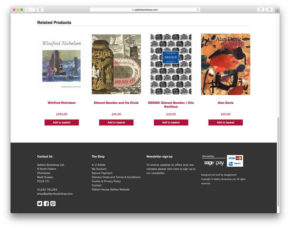
We made sure to utilise the data of their books to increase the search functionality; the website contains information about the Publisher, Format, Published Date, Contents, ISBN and links to biographies of the author and artists. The typeface and hierarchical layout makes it easy to find what you need. The website also generates related products based on the categories, content and tags.